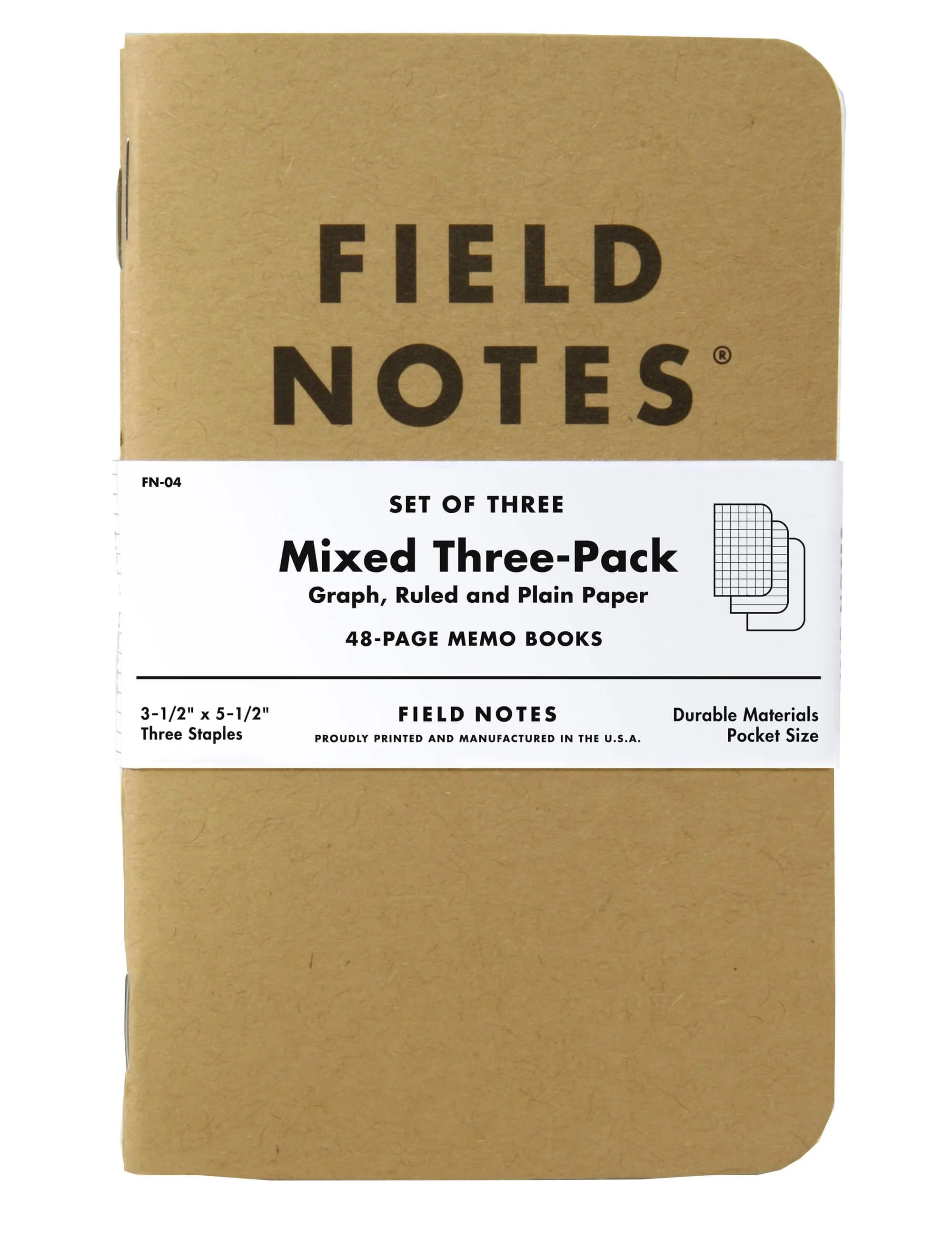
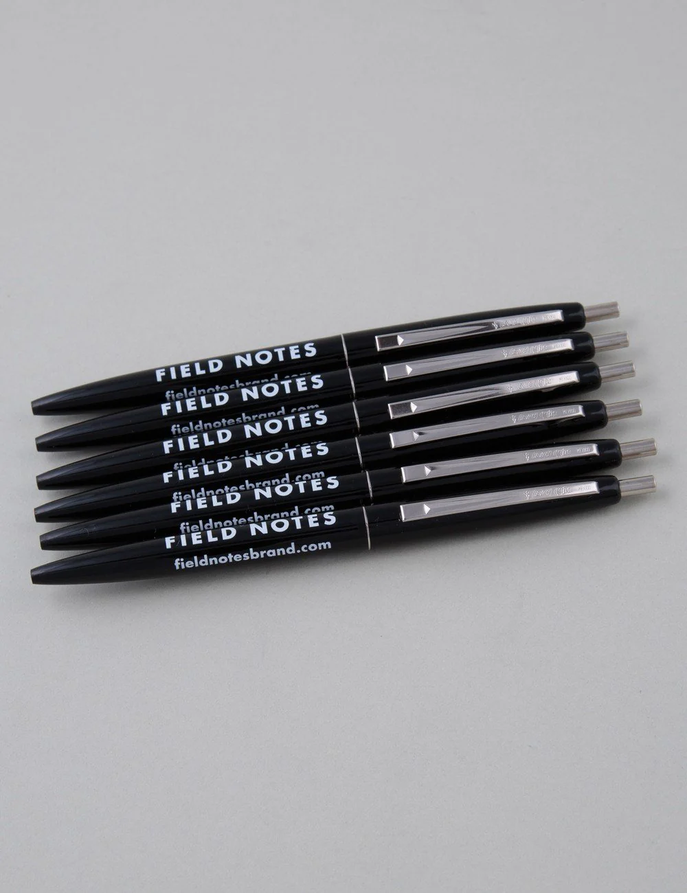
The Chicago Look (2pk)
Brushes With History --- The Chicago Look Edition
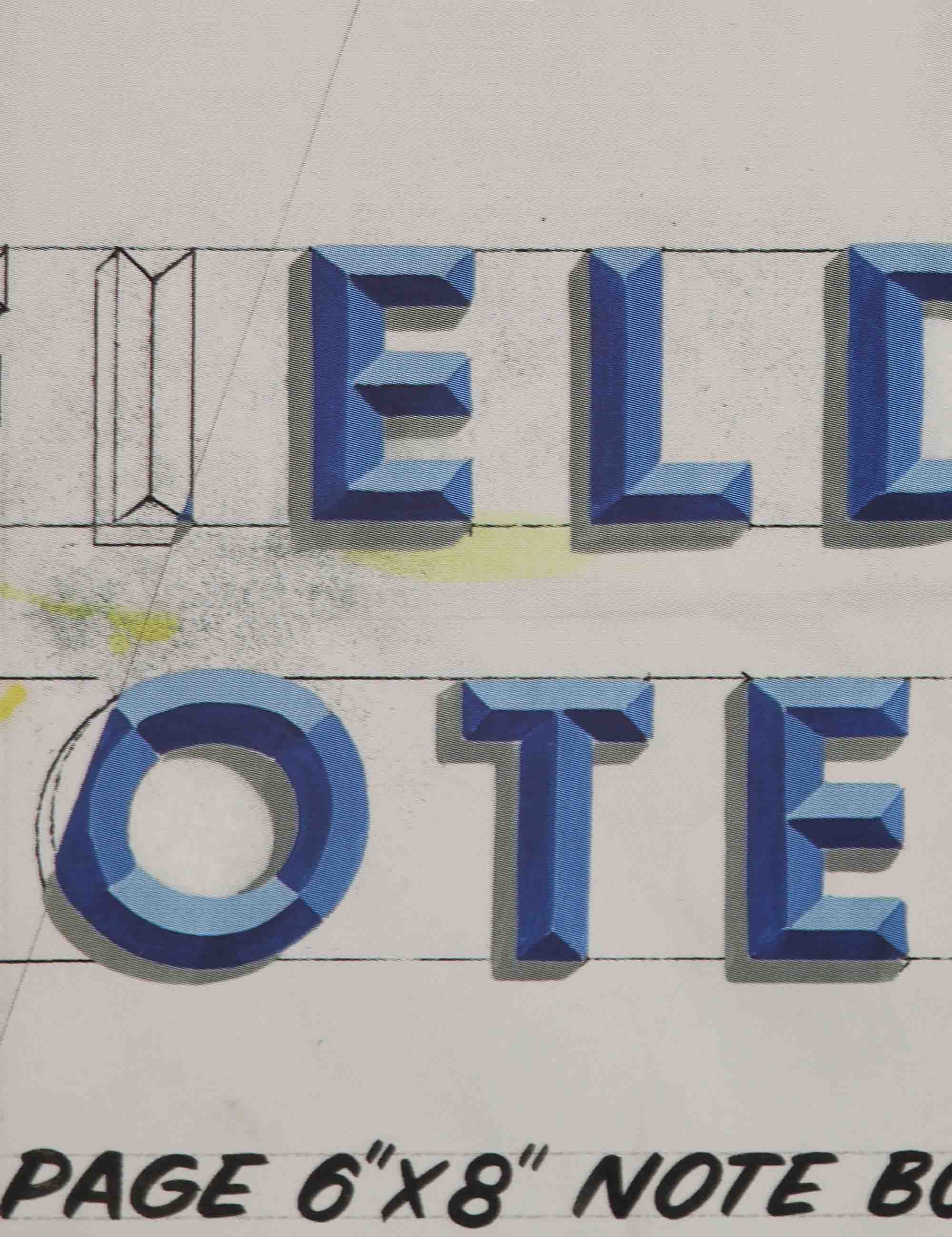
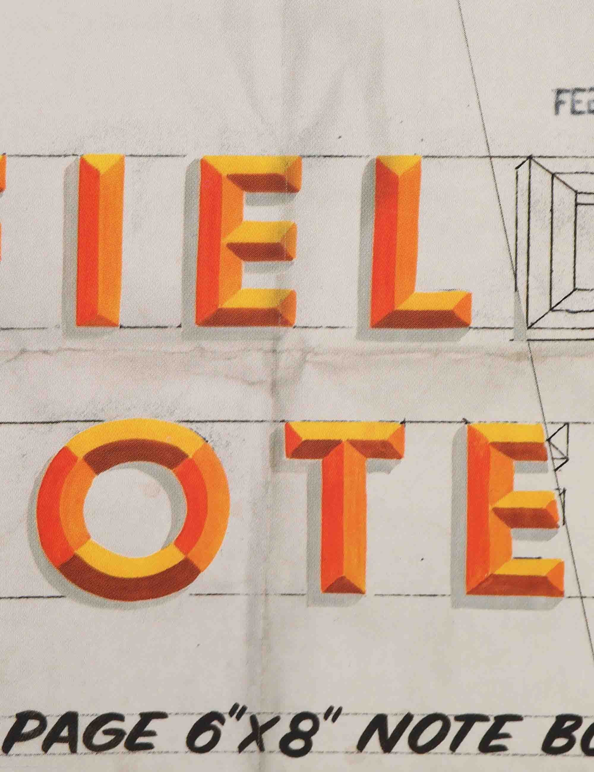
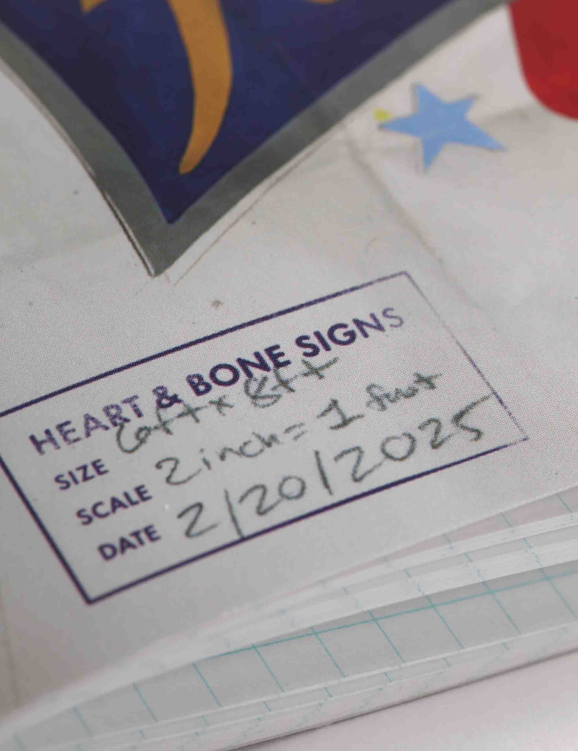
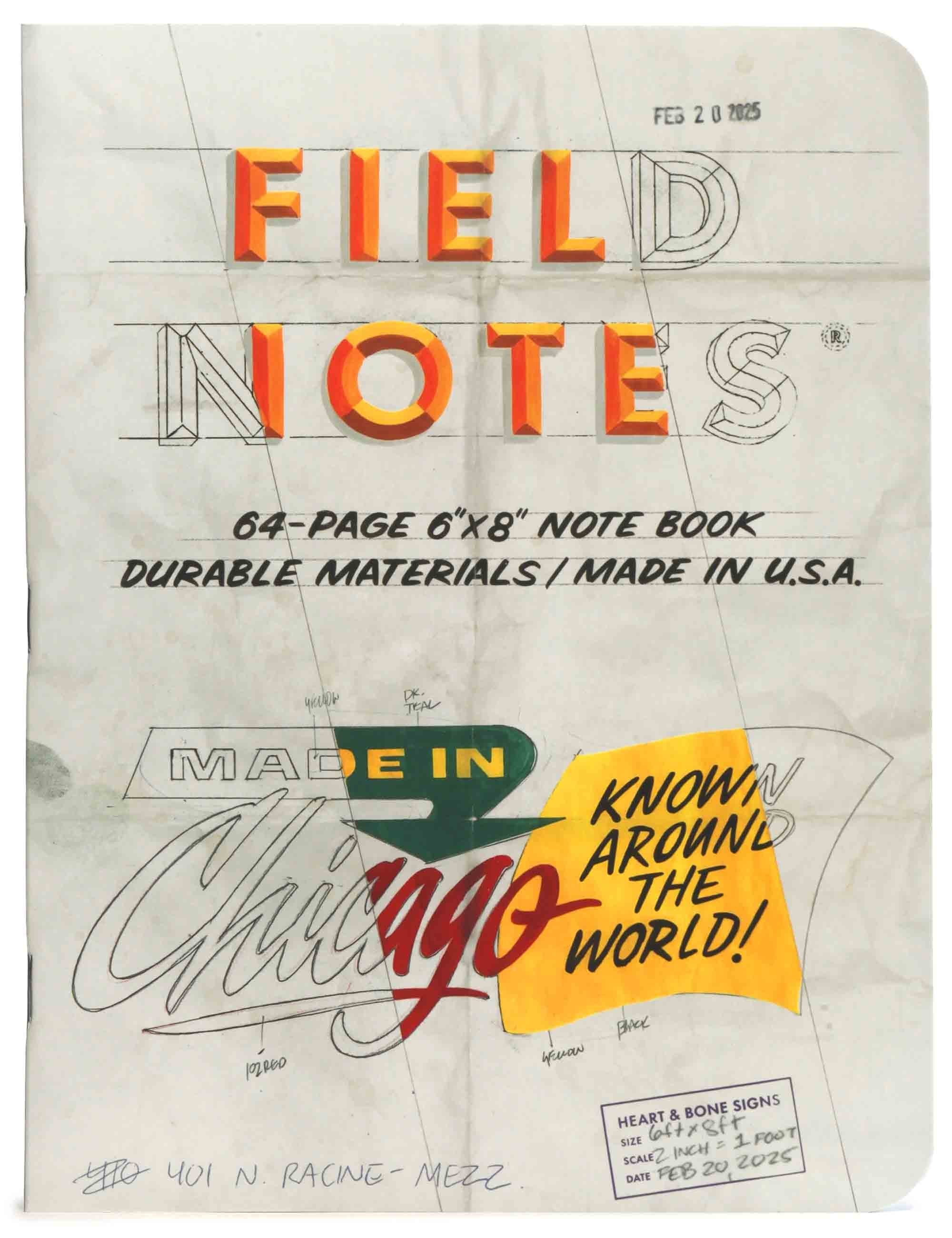
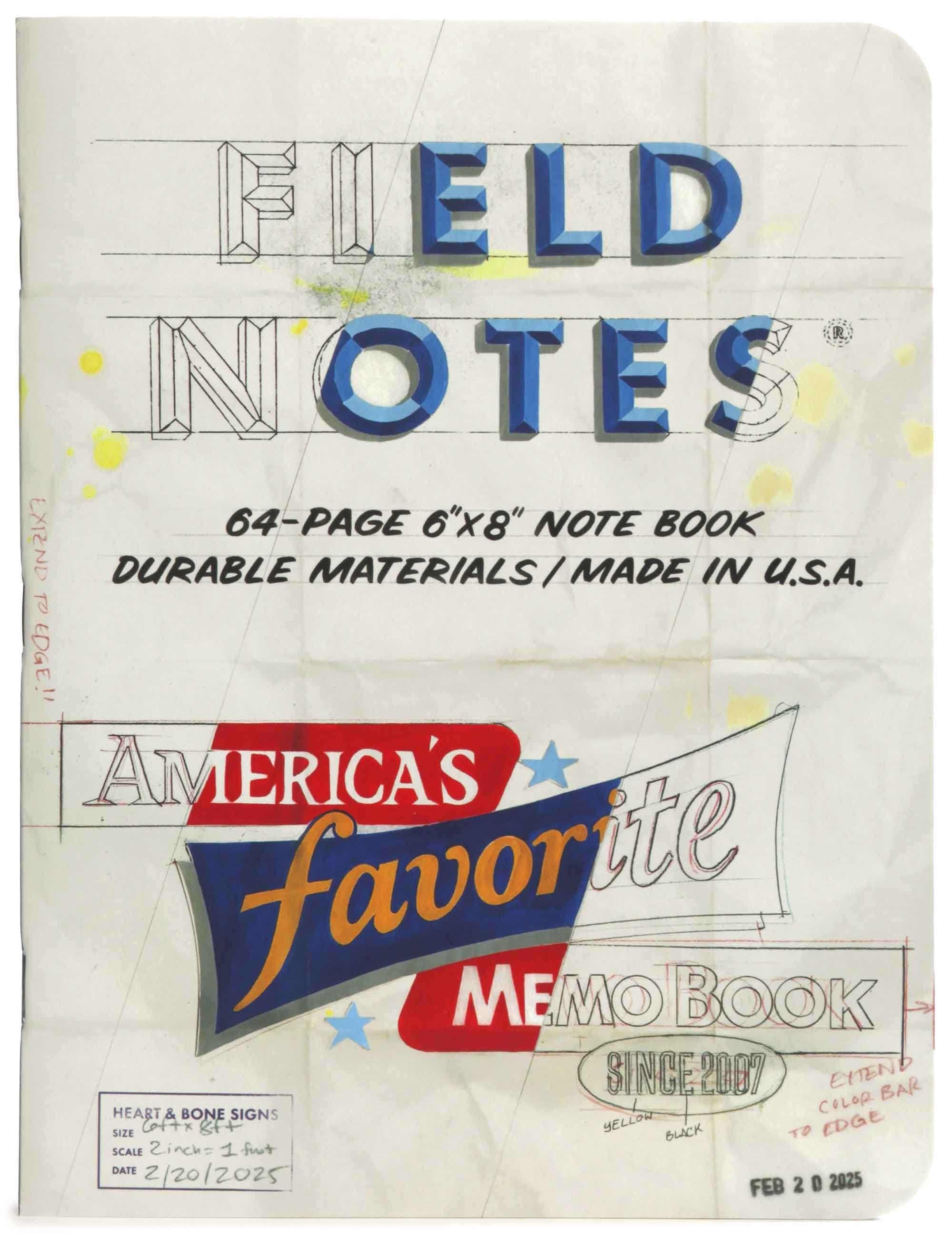
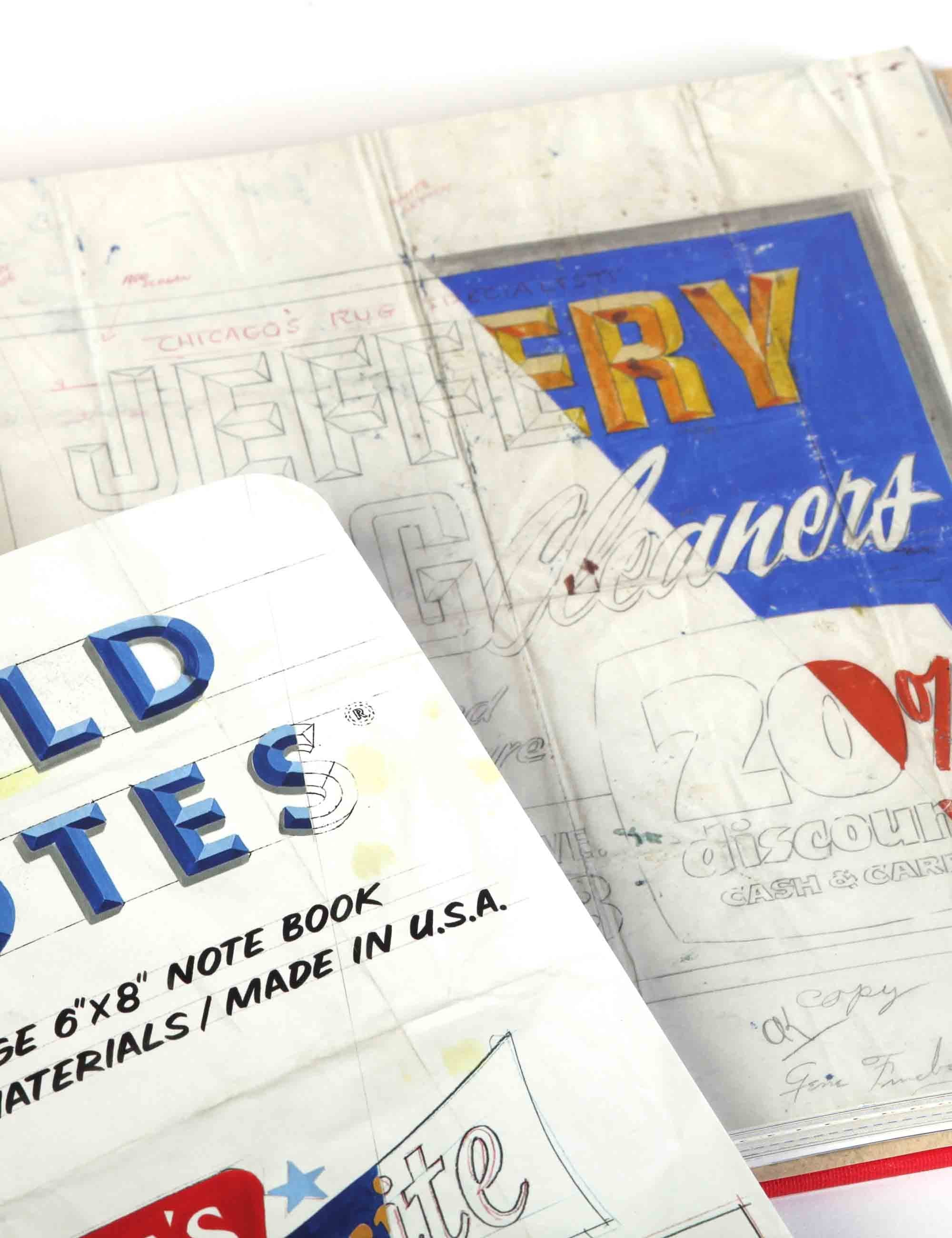
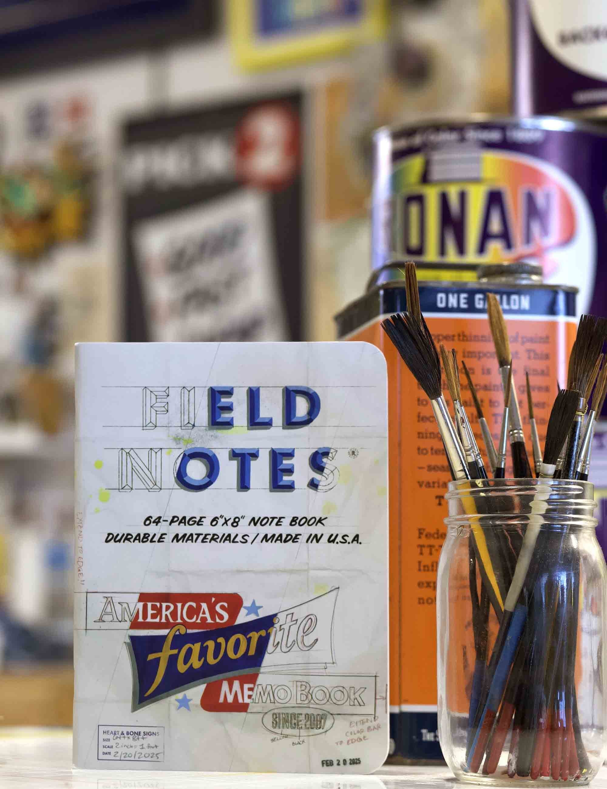
Step into a piece of American design history with our 66th Quarterly Limited Edition, The Chicago Look. This special release pays tribute to the mid-century typography and sign-painting artistry pioneered by the legendary (but sadly now-defunct) Beverly Sign Co. Known for its panelized compositions, bold strokes, and novel typographic treatments, Beverly's work put Chicago firmly on the map of iconic sign design. In collaboration with Heart & Bone Signs and sign-painting veteran Bob Behounek, we've recreated two covers inspired by Beverly's original pencil sketches. Each features the unmistakable diagonal "strike-thru" used by sign painters (the legendary "Wall Dogs") to indicate colours to clients and artists alike.
This edition introduces a new size - 6" -- 8" - perfect for creative minds. The graph-ruled pages in "Non-Repro Blue" pay homage to the graphic arts industry, offering a subtle grid that disappears when scanned or copied. As always, expect a deep dive into history inside the covers, alongside sharp illustrations and tongue-in-cheek commentary. Year-long subscribers get exclusive extras, including a 2.25 "Wall Dogs Forever" pin-back button and a postcard of a completed Beverly-inspired sign hanging at Field Notes HQ. And for those hungry for more, we have a limited run of first editions of The Golden Era of Sign Design, packed with over 100 original Beverly sketches and behind-the-scenes interviews.
Original: $24.35
-65%$24.35
$8.52
Description
Brushes With History --- The Chicago Look Edition
Step into a piece of American design history with our 66th Quarterly Limited Edition, The Chicago Look. This special release pays tribute to the mid-century typography and sign-painting artistry pioneered by the legendary (but sadly now-defunct) Beverly Sign Co. Known for its panelized compositions, bold strokes, and novel typographic treatments, Beverly's work put Chicago firmly on the map of iconic sign design. In collaboration with Heart & Bone Signs and sign-painting veteran Bob Behounek, we've recreated two covers inspired by Beverly's original pencil sketches. Each features the unmistakable diagonal "strike-thru" used by sign painters (the legendary "Wall Dogs") to indicate colours to clients and artists alike.
This edition introduces a new size - 6" -- 8" - perfect for creative minds. The graph-ruled pages in "Non-Repro Blue" pay homage to the graphic arts industry, offering a subtle grid that disappears when scanned or copied. As always, expect a deep dive into history inside the covers, alongside sharp illustrations and tongue-in-cheek commentary. Year-long subscribers get exclusive extras, including a 2.25 "Wall Dogs Forever" pin-back button and a postcard of a completed Beverly-inspired sign hanging at Field Notes HQ. And for those hungry for more, we have a limited run of first editions of The Golden Era of Sign Design, packed with over 100 original Beverly sketches and behind-the-scenes interviews.